Rabu, 25 Februari 2015

Basic color schemes

Basic color schemes
- Introduction to Color Theory

With colors you can set a mood, attract attention, or make a statement. You can use color to energize, or to cool down. By selecting the right color scheme, you can create an ambiance of elegance, warmth or tranquility, or you can convey an image of playful youthfulness. Color can be your most powerful design element if you learn to use it effectively.

Content

color wheelThe Color Wheel
primary secondaryPrimary, Secondary and Tertiary Colors
warm cool colorsWarm and cool colors
tints shades tonesTints, Shades, and Tones
color harmonies

Colors affect us in numerous ways, both mentally and physically. A strong red color has been shown to raise the blood pressure, while a blue color has a calming effect.
Being able to use colors consciously and harmoniously can help you create spectacular results.

The Color Wheel

Color wheel
The color wheel or color circle is the basic tool for combining colors. The first circular color diagram was designed by Sir Isaac Newton in 1666.
The color wheel is designed so that virtually any colors you pick from it will look good together. Over the years, many variations of the basic design have been made, but the most common version is a wheel of 12 colors based on the RYB (or artistic) color model.
Traditionally, there are a number of color combinations that are considered especially pleasing. These are called color harmonies or color chords and they consist of two or more colors with a fixed relation in the color wheel.
ColorImpact is designed to dynamically create a color wheel to match your base color.

Primary, Secondary and Tertiary Colors

In the RYB (or subtractive) color model, the primary colors are red, yellow and blue.
The three secondary colors (green, orange and purple) are created by mixing two primary colors.
Another six tertiary colors are created by mixing primary and secondary colors.
The above illustration shows the color circle with the primary, secondary and tertiary colors. Click on the labels to turn the colors on / off.

Warm and cool colorsWarm and cool colors

The color circle can be divided into warm and cool colors.
Warm colors are vivid and energetic, and tend to advance in space.
Cool colors give an impression of calm, and create a soothing impression.
White, black and gray are considered to be neutral.

Tints, Shades, and Tones

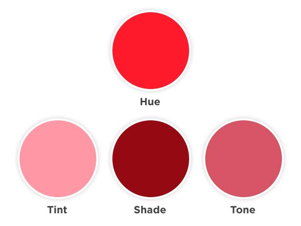
These terms are often used incorrectly, although they describe fairly simple color concepts. If a color is made lighter by adding white, the result is called a tint. If black is added, the darker version is called a shade. And if gray is added, the result is a different tone.
Tints - adding white to a pure hue:
tints

Shades - adding black to a pure hue:
Shades

Tones - adding gray to a pure hue:
Tones


Color Harmonies
- basic techniques for creating color schemes

Below are shown the basic color chords based on the color wheel.

complementaryComplementary color scheme
Colors that are opposite each other on the color wheel are considered to be complementary colors (example: red and green).
The high contrast of complementary colors creates a vibrant look especially when used at full saturation. This color scheme must be managed well so it is not jarring.
Complementary color schemes are tricky to use in large doses, but work well when you want something to stand out.
Complementary colors are really bad for text.

complementary scheme

analogousAnalogous color scheme
Analogous color schemes use colors that are next to each other on the color wheel. They usually match well and create serene and comfortable designs.
Analogous color schemes are often found in nature and are harmonious and pleasing to the eye.
Make sure you have enough contrast when choosing an analogous color scheme.
Choose one color to dominate, a second to support. The third color is used (along with black, white or gray) as an accent.

analogous scheme

triadTriadic color scheme 
A triadic color scheme uses colors that are evenly spaced around the color wheel.
Triadic color schemes tend to be quite vibrant, even if you use pale or unsaturated versions of your hues.
To use a triadic harmony successfully, the colors should be carefully balanced - let one color dominate and use the two others for accent.

triadic scheme

split-complementarySplit-Complementary color scheme 
The split-complementary color scheme is a variation of the complementary color scheme. In addition to the base color, it uses the two colors adjacent to its complement.
This color scheme has the same strong visual contrast as the complementary color scheme, but has less tension.
The split-complimentary color scheme is often a good choice for beginners, because it is difficult to mess up.
split-complementary scheme

Rectangle (tetradic) color scheme 
The rectangle or tetradic color scheme uses four colors arranged into two complementary pairs.
This rich color scheme offers plenty of possibilities for variation.
Tetradic color schemes works best if you let one color be dominant.
You should also pay attention to the balance between warm and cool colors in your design.
rectangle scheme

squareSquare color scheme 
The square color scheme is similar to the rectangle, but with all four colors spaced evenly around the color circle.
Square color schemes works best if you let one color be dominant.
You should also pay attention to the balance between warm and cool colors in your design.
square scheme

Color Wheel Primer

Color Wheel Primer

When you're decorating, choosing a color scheme can be a perplexing task. It's hard enough whittling down your choice to one or two colors — but then to have to mix and match even more of them into an eye-pleasing scheme? Sometimes considering the whole color wheel is just too much to ask.
Before you turn back on the world of color, get a grasp of the color wheel and how it works.

The Basic Wheel

In 1666, Sir Isaac Newton performed a prism experiment in which he discovered that pure white light contains the full spectrum of colors — in effect, creating the world’s first color wheel. From there, philosophers, scientists, artists and designers have continued studying the components of color and its physical, psychological and philosophical effects.
Newton's wheel is made up of 12 colors, which are classified into three categories:

Primary Colors: Red, Yellow and Blue

Secondary Colors: Orange, Green and Violet

Secondary colors are created by mixing primary colors.

Tertiary Colors

Tertiary colors are a combination of a secondary color and a primary color next to it. They include yellow-orange, red-orange, red-violet, blue-violet, blue-green and yellow-green.

Color Schemes

Now that you know the colors here are four common ways to use them in your home.

One Color — Monochromatic

Take baby-steps toward color with a monochromatic scheme. It's simply one color in varying intensities from light to dark.

Two to Six Colors — Analogous

Branch out into color with an analogous scheme, which consists of two to six colors that sit next to each other on the wheel.

Two Colors — Complementary

Want to go for high-contrast color? Use a complementary scheme — it includes hues that are directly across from each other on the wheel.

Three Colors — Triad

A triad scheme is bold but more importantly, it's balanced. It's made up of any three colors that form a triangle in the center of the wheel.

Color Dimensions

In addition to understanding how colors work together, it's also helpful to know the three dimensions of the colors on the wheel.
Hue is commonly used interchangeably with the word color but technically refers to the pure spectrum colors in the color wheel.
The value of a hue is determined by adding white to create a tint, black to create a shade or gray to create a tone.
Saturation is the purity of the hue. The colors on the wheel are considered to be in their purest form. As the colors move towards the center, as shown in the graphic at right, they are considered desaturated where no hue dominates.

Natural Reactions to Color

Do you shiver when you’re in a light blue space? Fan yourself in a room full of red? Don’t worry — there’s a scientific reason why. Colors are indelibly tied to natural elements like fire, water, sky, evoking certain responses just as if you were seeing and experiencing it firsthand.

Cool Colors

Cool colors like blue and green do just that — cool and soothe your mind, body and spirit. It's no wonder we flock to the ocean and mountains to rejuvenate our senses. These hues are best used in rooms where you want serenity to prevail.
If cool colors make you geel good, check out these refreshing rooms for decorating inspiration:

Warm Colors

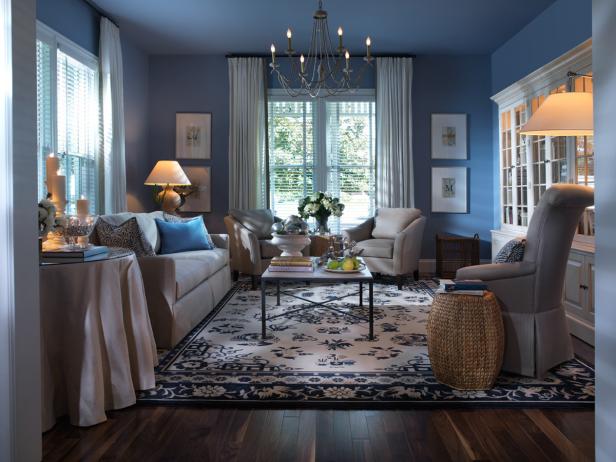
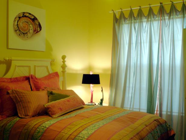
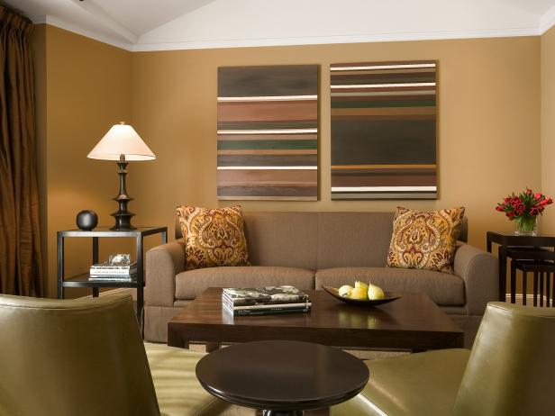
Warm colors like red, orange and yellow give off an energy and intensity unmatched by their cooler cousins. Use these hues in rooms where you anticipate (and want) activity and stimulation, like a kitchen, child’s playroom or exercise space.
If warm colors are for you then take a look at these rooms:

Minggu, 01 Februari 2015

Advanced Photoshop Magazine Issue 131 2015

Advanced Photoshop Magazine Issue 131 2015

Advanced Photoshop Magazine Issue 131 2015

Advanced Photoshop Magazine Issue 131 2015

English | PDF | 100 Page | 50 Mb
Download : Mediafire
Pasword : blog-senirupa

Digital Exposure Handbook Free Download

Digital Exposure Handbook Free Download

Digital Exposure Handbook

Exposure is a fundamental part of photographic technique, but is often thought of as mysterious or difficult to understand. In this revised edition of Ross Hoddinott's successful book ˜Digital Exposure Handbook' the nitty gritty of this fascinating subject is unravelled and presented in a clear and easy-to-understand way. This practical, handbook size, jargon-free guide will be your essential companion out in the field, so slot it in your backpack and start taking some stunning shots.Although the process of making a successful exposure is based on science, a photographer's individual interpretation means that creativity becomes part of the equation. Digital cameras have brought a new dimension to exposure control, offering photographers the ability to review images in the field, as well as being able to change the sensitivity of the sensor from shot to shot. This comprehensive book will give you the confidence to put theory into practice and enable you to achieve creative control over your images.Chapters cover: Understanding the basics of exposure Putting exposure into practice Dealing with ambient light Using flash light Applying digital filters Exposure in the digital darkroomKey points: Successful book, revised and updated with many new photographs Easy-to-carry format Plenty of extended information panels and exposure tip boxes throughout Clear layout and colour-coded chapters make it very easy to navigate.

Ebook Detail :

Title : Digital Exposure Handbook
Author : Ross Hoddinott
Paperback: 192 pages
Publisher: Ammonite Publications; Revised edition edition (April 1, 2013)
Language: English
ISBN-10: 1907708952
Resource : http://www.amazon.com/Digital-Exposure-Handbook-Ross-Hoddinott/dp/1907708952
Size : 17,7Mb

Download : Mediafire
Pasword : blog-senirupa

Sabtu, 24 Januari 2015

Advanced Photoshop Magazine Issue 130 2015

Advanced Photoshop Magazine Issue 130 2015

Advanced Photoshop Magazine Issue 130 2015

Advanced Photoshop Magazine Issue 130 2015

English | PDF | 100 Page | 19 Mb
Download : Mediafire
Pasword : blog-senirupa

Sabtu, 17 Januari 2015

Advanced Photoshop The Premium Collection Vol.8

Advanced Photoshop The Premium Collection Vol.8

Advanced Photoshop The Premium Collection Vol.8

Advanced Photoshop The Premium Collection Vol.8

English | 196 pages | True PDF | 66.50 Mb
Download : Mediafire

Advanced Photoshop Magazine Issue 121 2014

Advanced Photoshop Magazine Issue 121 2014

Advanced Photoshop Magazine Issue 121 2014

Advanced Photoshop Magazine Issue 121 2014

English | PDF | 100 Pages | 38 Mb
Download : Mediafire
Tutorial File : Click Here

Advanced Photoshop Magazine Issue 122 2014

Advanced Photoshop Magazine Issue 122 2014

Advanced Photoshop Magazine Issue 122 2014

Advanced Photoshop Magazine Issue 122 2014

English | PDF | 100 Pages | 38,9Mb
Download : Google Drive
Pasword ; blog-senirupa
Tutorial File : Click Here


Advanced Photoshop Magazine Issue 119 2014

Advanced Photoshop Magazine Issue 119 2014

Advanced Photoshop Magazine Issue 119 2014

Advanced Photoshop Magazine Issue 119 2014

English | 100 pages | True PDF | 41.00 Mb
Download : Mediafire

Advanced Photoshop Magazine Issue 120 March 2014

Advanced Photoshop Magazine Issue 120 March 2014

Advanced Photoshop Magazine Issue 120 March 2014

Advanced Photoshop Magazine Issue 120 March 2014

English | PDF | 51 Pages | 52 Mb
Download : Mediafire
Tutorial File : Click Here

Advanced Photoshop Magazine Issue 129

Advanced Photoshop Magazine Issue 129

Advanced Photoshop Magazine Issue 129

Advanced Photoshop Magazine Issue 129

English | PDF | 98 Page | 23 Mb
Download : Mediafire
Pasword : blog-senirupa

Minggu, 07 Desember 2014

Photoshop Creative Magazine Issue 120 2014

Photoshop Creative Magazine Issue 120 2014

Photoshop Creative Magazine Issue 120 2014

English | PDF | 100 Pages | 54 Mb
Download : Mediafire
- See more at: http://blog-senirupa.blogspot.com/2014/11/photoshop-creative-magazine-issue-120.html#sthash.CpPULaqL.dpuf

Practical Photoshop Magazine December 2014

Posted: 01 Dec 2014 05:22 AM PST
Practical Photoshop Magazine December 2014

Practical Photoshop Magazine December 2014

English | PDF | 26 Pages | 19,8 Mb
Download : Mediafire
Pasword : blog-senirupa